More long distance in ZOE – 520 miles in a weekend

ZOE Charging at Woodall South (Image: Timbo)
Two ZOEs Charging at Woodall South (Image: Timbo)

I’m using my Zoe more and more these days. Although I work from home a lot, I also regularly stray quite a long way from home on the northern edge of the North York Moors.  Recent (now routine) trips have taken me to Newcastle, York, Leeds, Sheffield and even Manchester airport and I’ve also visited family in the Scottish Borders. All trips with one, two or three charges in each direction. I’m doing about 1,000 miles a month now – thanks in large part to the Electric Highway from Ecotricity and Charge your Car.

Chepstow Route (Image: Timbo)

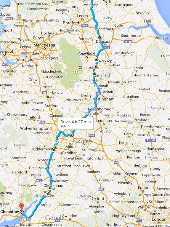
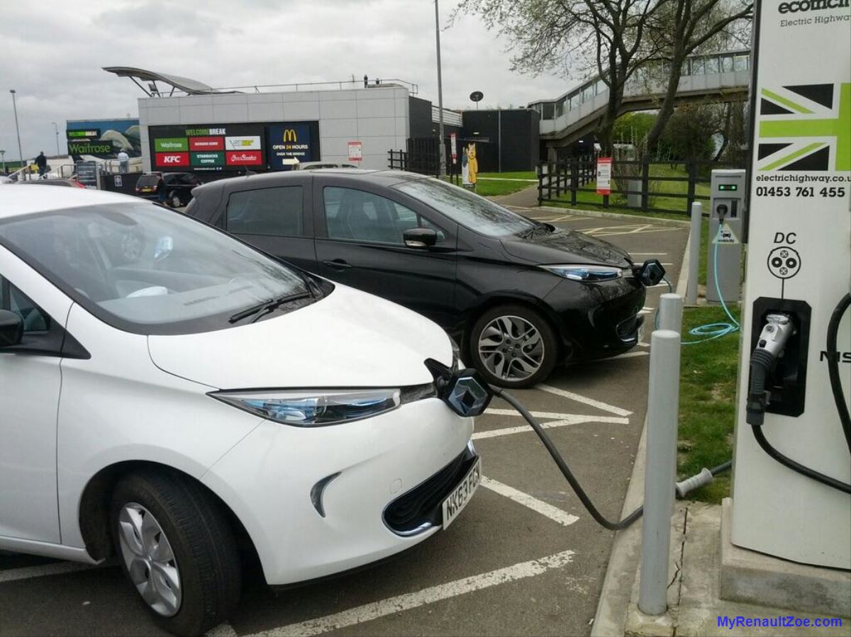
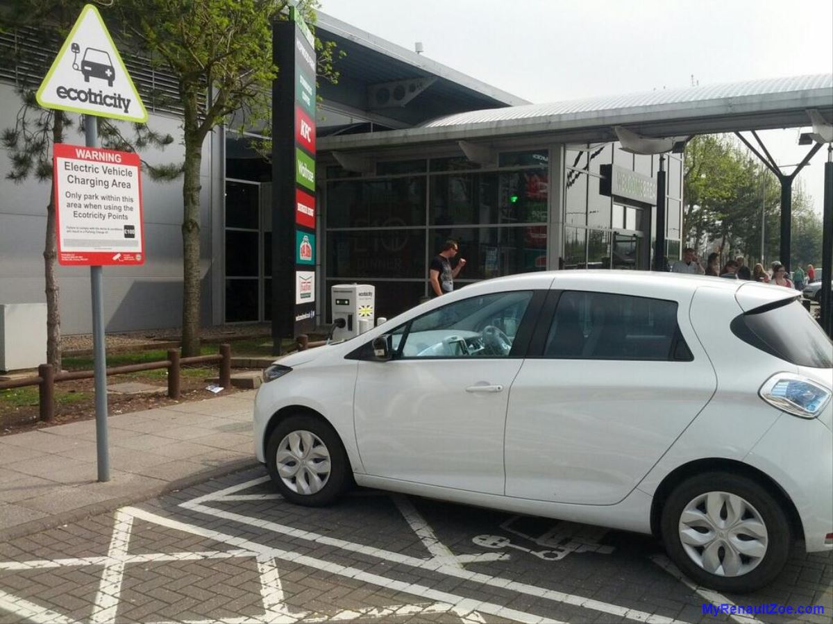
My most recent trip over the Easter break was  to Chepstow. Both the southbound and the return trip were straightforward. All of the Ecotricity fast chargers were in working order – despite the Ecotricity website reporting some as faulty. I was a little worried when the Whetherby one showed as off-line as without this I have a long detour via York. So,  I contacted @ElecHighway via Twitter to check the status of Wetherby, since I was aware that the majority of faults are on the DC-side. They came back quickly to report that only the DC-side that was out of action. So whilst no use for LEAF colleagues, but fine for ZOE. On the back of this and experience on the way home too, I decided that I’ll always try a fast charger that is reported as off-line – the AC-side seems pretty reliable to me.

ZOE Charging at Michaelwood (Image: Timbo)

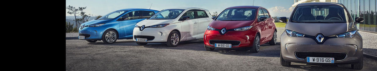
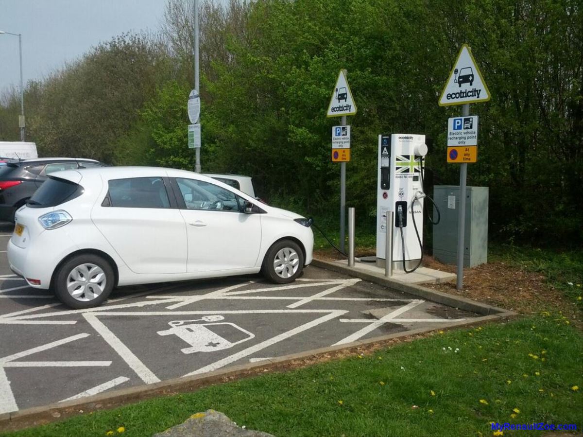
I rapid charged at Wetherby, Woodall and Tamworth then broke my southbound journey at Frankley Services on M5 near Birmingham (why pick anywhere to stay that doesn’t have charging …?).  I also saw my first other Zoe on a motorway when I stopped at Woodall. The driver here had tried the fast charger but had given up on it and was using the 22kW one. The rapid worked fine for me,  so we twinned up for a while and chatted.

ZOE Charging at Hopwood (Image: Timbo)

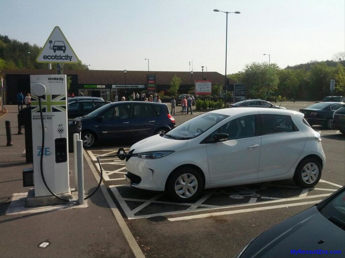
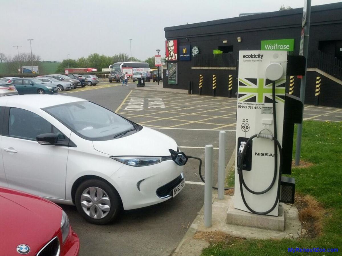
The following morning, I left Frankley for the run down the M5, stopping at Michaelwood services, followed by a quick top-up at the Severn View services at the Severn Bridge. This last charge wasn’t really necessary, but as I was staying with friends who didn’t have a charge point, I figured arriving with a full charge was sensible.

ZOE Charging at Donnington (Image: Timbo)

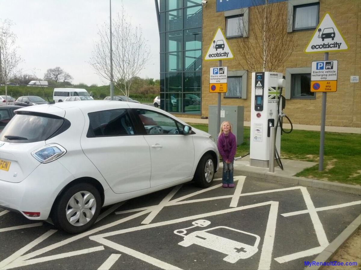
My return trip a couple of days later was done in a single 260 mile trip. I tweeted at each of the 5 charging stops this time which Welcome Break liked so much that they sent me a £5 voucher for a free coffee! The sun shone for the whole trip and I lost count of the number of people who came up to me to  ask me about the car whilst I was at each service station.

ZOE Charging at Woodall (Image: Timbo)

Charges on the way back were at:

  • Michaelwood,
  • Hopwood (M42),
  • Donnington (M1),
  • Woodall (M1) and
  • Wetherby (A1).

At each I charged to between 80-90%, so that I was on my way again in 20-30 mins each time.

ZOE Charging at Wetherby (Image: Timbo)

The verdict from this trip and others – it really is easy these days. I really don’t think I’ll ever go back to an ICE car.

How and When Will Electric Cars Replace Fossil-Fuelled Cars? Part 2

I explained previously that I believe that it is possible to predict future adoption rates and market share of sales for EVs. Specifically, I proposed that a suitable approach would be to apply what we know of EV market share so far to a suitably scaled innovation adoption S-curve on the core assumption that EVs will follow a suitable uptake to iPods, smartphones, flat-screen televisions and other consumer technologies.

The particular S-curve being considered is a form of logistic function, so named by the French mathematician Pierre François Verhulst who studied it in relation to population growth. The initial stage of growth is approximately exponential; then, as saturation begins, the growth slows, and at maturity, growth stops.

Figure 1: Projected UK Electric Car Sales Market Share (Image: T. Larkum)

I don’t want to get bogged down in mathematical details so it should suffice to say that we are solving an equation of the form:
Projection_EVSales-Logistic_General_TLarkum
where we are trying to find x, essentially a scale factor, so that the market share for a particular year y matches what we expect (i.e. the known market share for electric vehicles since their recent relaunch). Finding a match also gives us the year from which to count y.

We know the monthly market share values for EVs for recent years so from the same source we can get annual totals. For the purpose of this discussion I am considering only the UK sales for the years 2011, 2012, 2013 and 2014 since the recent market growth was kick-started by the UK government’s Plug-In Car Grant which began on 1 January 2011. The figures I have from SMMT for 2011, 2012 and 2013 are given in Table 1. For 2014 I am using the latest figure reported, that for March 2014.

Table 1: UK Electric Car Market Share and Sales (Image: T. Larkum)

From an analysis of the results of various values for the scale factor I have come to the value of x = 0.498 as the best match. In other words, based on the limited data so far, if EV sales market share is following a technology adoption S-curve and if it continues to do so then I predict sales market share to be:

Projection_EVSales-Logistic_Specific_TLarkum

On this basis I have added into Table 1 the market share of sales that this gives for the known years, so it is possible to judge how well it fits. In addition, I have shown what it predicts for representative future years. Further, I have shown what this translates to in terms of sales of electric cars (assuming the UK market continues at its current rate of two million car sales per year). The market share values are also charted in Figure 1.

In broad brushstrokes, here are some interesting projections that this result gives us:

  • The changeover from internal combustion engine cars to electric cars will take 32 years, from 2010 to 2042.
  • The key year is 2026 – in this year more than half of all cars sold will be electric. In other words, in 2026 the default type of car sold is the electric car, with other fuel types in the minority.
  • In 2014 we are already 4 years in to the changeover, so there are just 12 years left until the 2026 crossover point.
  • Although the complete changeover (so that effectively ICE cars are no longer sold) takes a considerable amount of time, even by 2030 some nine out of ten cars sold will be electric.
  • It is expected that sales at the start are low, as they currently are, but they will rise quickly. Market share of new sales will be just 2% by 2018 but 5% by 2020 and 25% by 2024.
  • The decade from 2020 to 2030 will see a dramatic influx of electric cars, from 5% of new cars in 2020 to 90% in 2030.

Reducing Our Energy Carbon Footprint

Figure 1: Our Energy Carbon Footprint (Image: T. Larkum)

I am currently doing an educational course in climate change and as part of that I have conducted a project to calculate my family’s carbon footprint. Here I would like to pass on some of what I have learned about our energy carbon footprint, that part of our footprint resulting from domestic energy consumption and operating a car. Other aspects of a carbon footprint are just as important, related to what you buy, where you travel, what you eat, and so on, but unfortunately are much harder and less reliable to calculate.

For our energy footprint I have gone as far forward as June 2014 and as far back as 2008, the furthest year for which I have reliable energy consumption records. In all cases I have had to use estimates to fill in gaps in the available data. I am specifically looking at our household usage of natural gas and electricity, and my use of a car. Originally I did it per year but have since broken it down further into six month periods as this shows up changes in energy consumption, resulting from changes in lifestyle, more clearly.

The basic chart can be seen in Figure 1 (with the carbon cost of each fuel calculated via CarbonFootprint.com). It can be seen over most of the period that gas, electricity and the car each contributed roughly one third to the overall footprint. There is also a tendency for the first six month period in each year to have a higher gas footprint than the second period, essentially due to the coldest months (January and February) falling in the first period.

Now for some background on our lifestyle changes during this period. I began reducing our energy footprint in the summer of 2010. Firstly, I installed solar panels on our roof. At the time I was not considering our footprint; rather I did it as an investment, and because I liked the idea of ‘getting something for nothing’, which is a pretty good description of solar power. Secondly, we took advantage of a particular special offer from British Gas and had our old boiler replaced with a more efficient model.

It wasn’t until the start of 2012 that I started reading about global warming and started to get interested in (and concerned about) climate change. By 1st May I had ordered my Renault ZOE electric car, though it was to be more than a year before it was actually delivered.

So let’s now analyse the data in more detail and see what we can learn. These are the key elements as I see them:

  1. Gas: I believe there is a visible/detectable drop in typical gas usage after the summer of 2010 and that this is attributable to the more efficient boiler.
  2. Gas: Notwithstanding the change in boiler, the end 2012/early 2013 periods show particularly high gas usage because of the severe winter.
  3. Gas: The end 2013/early 2014 periods show low gas usage because of the mild winter.
  4. Electricity: There is a very clear drop in electricity usage after the end of 2010. This is due to the solar array since it generates nearly as much electricity as we use, and I am calculating the carbon footprint for the net electricity used over the period.
  5. Electricity: There is no electricity carbon footprint after the summer of 2013 as we changed over to a completely green/renewable electricity tariff (from Ecotricity).
  6. Car: I use my car for commuting to work so I did an approximately constant mileage over the period. For most of the time it was with a thirsty Vauxhall Zafira (giving about 32mpg), hence the high carbon footprint.
  7. Car: The Renault ZOE arrived in July 2013 so the second half of 2013 shows a reduced car footprint. 2014 onwards shows no car footprint – this is true whether it is considered either to be powered from entirely renewable energy, or from our excess of solar electricity.
Figure 2: Our Energy Carbon Footprint with ‘Tipping Points’ Labelled (Image: T. Larkum)

The good news is clearly that we have managed in six years to reduce our energy carbon footprint from about 5 tonnes of CO2e (carbon dioxide equivalent) per 6 month period to about 1 tCO2e. However, there is clearly no case to justify us resting on our laurels:

  • Our gas usage is still huge at about 2 tonnes CO2e per year. I can see no simple solution to this. In the short term we will likely start to use electricity to heat our hot water. Longer term we may need to move the house from gas central heating to electricity storage heaters or similar.
  • As mentioned at the start, our energy footprint is just one part of our total footprint. Our core ‘secondary’ footprint is something like 6 tonnes (from food, shopping, entertainment, etc.). In addition, a typical family holiday to Spain would add another 2 tonnes. Significant changes here would require major lifestyle changes, like giving up holidays and becoming vegetarian.

So taken altogether, our 80% reduction in energy footprint is probably only a 30% reduction in our total carbon footprint – and yet it was the easiest part to reduce.

UK Electric Car Sales

Electric Cars Parade Past Parliament (Image: Carsoholic.com)

As a UK electric car early adopter I am naturally interested in how well EVs are doing in the market. There doesn’t seem to be a definitive source of information on the subject, but I have found a pretty good source of statistics at the website of the Society of Motor Manufacturers and Traders (SMMT.co.uk). These stats cover the sales of a large range of vehicles like buses and other commercial vehicles but also include monthly car sales.

These overall numbers are further broken down into ‘EV Registrations’, for example the March 2014 results have just been posted. In SMMT terms these registrations actually cover four separate categories:

  • Plug-in – Pure electric
  • Plug-in – Other electric
  • Hybrid – Petrol/electric
  • Hybrid – Diesel/electric

So the first issue we hit is that SMMT regards conventional (i.e. non plug-in) hybrids like the Toyota Prius as EVs, which is patently daft. For my purposes I am considering only plug-ins as EVs, though accepting any type of plug-in – a standard interpretation (and consistent with the government’s criteria for the plug-in grant). Personally I’m a fan of pure electric plug-ins, but I can certainly see the benefits of plug-in hybrids like the Vauxhall Ampera or BMW i3 REx and believe they have a key role to play in the transition of the market to pure EVs.

To work out historical EV sales I’ve gone through the SMMT website to collate the statistics from each month back to September 2011 (the earliest report I could find). This process is complicated by the fact that before April 2013 the sales of EVs and AFVs (‘alternatively fuelled vehicles’, such as those using LPG) were reported together, without non-pure electric plug-ins previously being reported directly. Nonetheless it is possible to deduce these figures. Anyway, I see this change of reporting as a positive sign that EVs are becoming a powerful force in the market and are already pulling clear of LPG and other ‘also-ran’ AFV technologies.

Since I am interested in the total number of EVs being sold – rather than accounting numbers for the sake of it – I have taken the number of EVs sold each month as being the total of the pure electric and non-pure electric plug-ins each month, or the total number of cars eligible for the plug-in grant, whichever is greatest (in nearly all cases these figures are about the same).

Table 1: UK Electric Car (Plug-in) Sales (Image: T. Larkum)

While it would ideally be useful to consider the total number of EVs on the road against the total number of cars on the road – i.e. the total market share – the current growth of EVs is so recent that that would be a very low figure. However, we can get an indication of the market share of monthly sales achieved by EVs by considering the EV sales in a particular month against the total car sales for that month. While these figures are still low, they are not insignificant and are definitely increasing.
The sales figures for plug-ins from September 2011 to March 2014 are shown in Table 1, along with the total number of cars sold and the EV percentage market share of sales. The highest figure achieved in each column is highlighted.

Figure 1: UK Electric Car (Plug-in) Sales Numbers (Image: T. Larkum)

It’s clear that March 2014 was a truly bumper month for sales of EVs, with more than twice as many sold as in any previous month. However, to discern longer term trends it is useful to graph the figures. Figure 1 shows the number of EVs sold per month and Figure 2 shows the percentage of sales market share. This latter view is more useful since it evens out the ‘lumpy’ nature of car sales in general, with sales varying significantly from month to month, and with particular peaks in March and September when the new registration plates come in.

Figure 2 is very encouraging and shows clear long-term growth in EV market share. Nonetheless, it is itself rather ‘lumpy’ and this likely reflects the small nature of the market and that individual car model launches have a significant effect on monthly sales. For example, one can likely deduce that peaks in sales in the summer of 2013 reflected the launch of the Renault ZOE, and that peaks in late 2013 and early 2014 coincide with the launch of the BMW i3. As the market diversifies with more models on sale, however, the curve is likely to become smoothed out.

Figure 2: UK Electric Car (Plug-in) Sales Market Share (Image: T. Larkum)

Nonetheless, the trends of increasing EV sales numbers and – more significantly – increasing sales market share are clear and unequivocal. EVs are here to stay. Whether the fantastic sales in March 2014 represent a blip, however, or the start of major growth in EV sales remains to be seen.